You need to show a teammate one button on a page — highlighted, with the rest dimmed so it’s obvious. If you’re like a lot of designers and front-end folks, your reflex is: screenshot the page, paste it into Figma, draw a rectangle, dim the background, export. It works. It also takes a few minutes you didn’t really want to spend.
The Figma screenshot workflow is the default for a lot of teams because Figma is already open and everyone knows it. But “already open” isn’t the same as “fastest.” This is an honest comparison of the Figma approach versus a one-click browser extension like Spotlight — where each wins, and roughly how much time sits between them.
Why this comparison matters
Highlighting a UI element for a bug report, a doc, or a design note is a tiny task you do many times a day. At a few minutes each, the cost is invisible per instance and significant over a week. The question isn’t “can Figma do it” — Figma can do almost anything. It’s “is a general-purpose design tool the right weight for a 10-second job?”
The honest answer depends on what you’re making. So let’s walk both workflows step by step.
The Figma screenshot workflow
Here’s the path most people actually take when highlighting an element in Figma:
- Take a screenshot of the page (
Cmd+Shift+4/Win+Shift+S) - Switch to Figma, paste the image into a frame
- Draw a rectangle over the whole image, fill it black, drop the opacity to ~50% — that’s your dim layer
- Draw a second rectangle around the element you want to highlight and cut it out of the dim layer (or add a bright border)
- Maybe add an arrow or a label
- Select the frame, export as PNG, find it in your downloads, share it
Pros: Total control. Pixel-perfect alignment, exact brand colours, reusable components, and you can keep annotating — arrows, callouts, multiple states on one canvas. For polished documentation, onboarding decks, or design specs, this is genuinely the right tool.
Cons: It’s 5–7 manual steps and a couple of minutes once you account for context-switching, getting the dim opacity consistent, and exporting. Do it twice with slightly different settings and your screenshots won’t match. And the moment the page changes, the whole thing is stale — you re-shoot and redo the overlay from scratch.
The Spotlight workflow
Spotlight does the highlighting on the live page, before you ever take the screenshot:
- Click the floating button to start (or press
Alt+Shift+S) - Click the element you want — it stays lit, everything else dims
- Press
S, click, and the focused screenshot saves to your downloads
That’s it — three actions, no second app, no manual overlay.
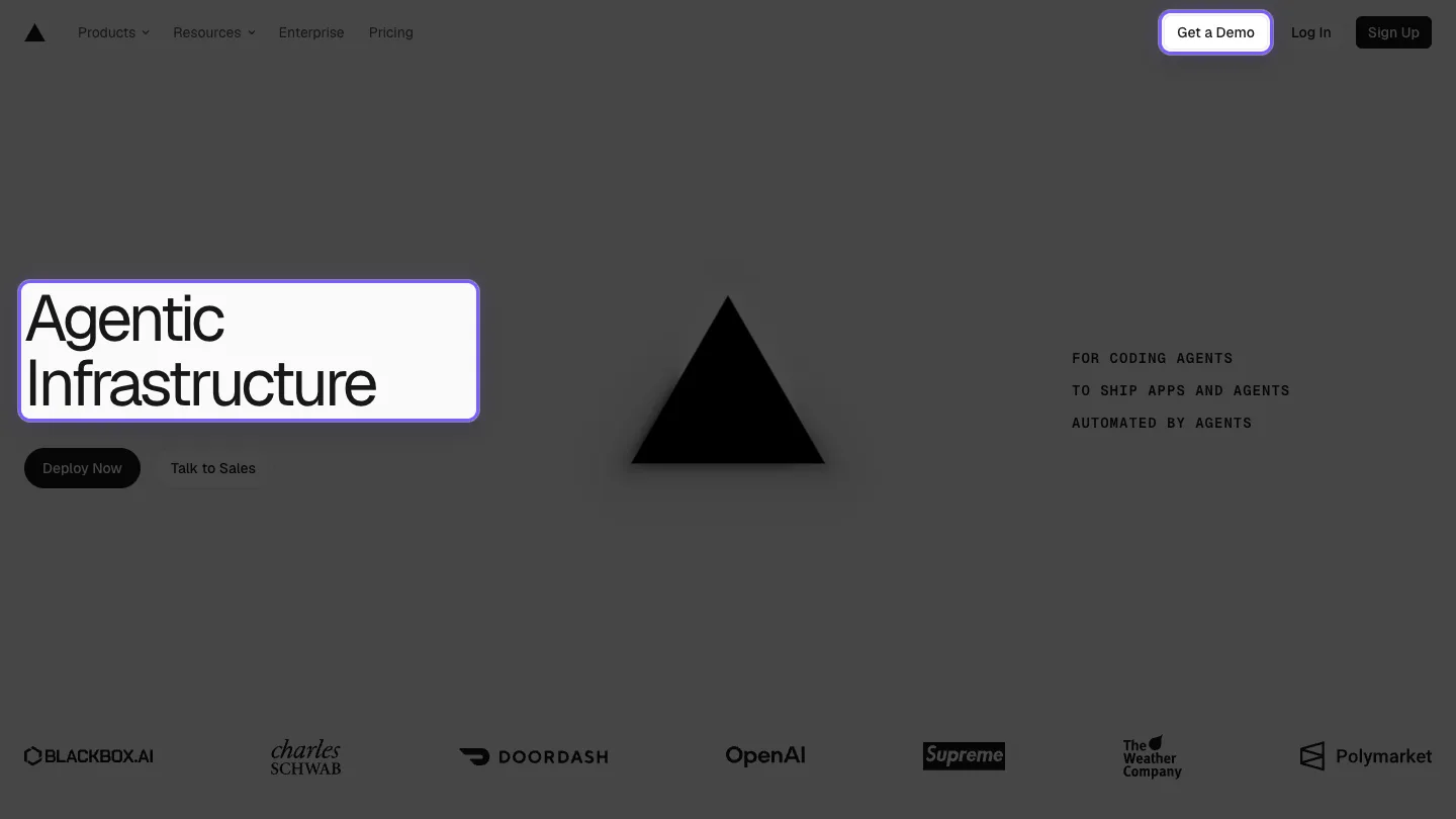
Pros: Fast — highlight and capture in well under 10 seconds. The dim and the bounding box are consistent every time because they’re generated, not hand-drawn. Page context stays intact, so the viewer sees where the element lives. Re-shooting after a page change is just clicking again.
Cons: Less annotation flexibility than a full design tool. No freehand arrows or multi-state canvases, and the styling options are deliberately limited (accent colour, dim intensity, labels). If you need a composed figure with callouts and captions, this isn’t that.
Side by side
| Figma workflow | Spotlight | |
|---|---|---|
| Steps | 5–7 (screenshot → paste → dim → cut out → export) | 3 (start → click → capture) |
| Time per shot | ~2–4 minutes | Under 10 seconds |
| Consistency | Manual — varies per shot | Generated — identical every time |
| Page context | Preserved (if you screenshot the full page) | Preserved by design |
| Annotation depth | High — arrows, labels, multi-state | Low — highlight + dim + simple labels |
| Re-shoot after page change | Redo the overlay from scratch | Click again |
| Best at | Polished figures, specs, decks | Fast, repeatable highlight-and-capture |
So which should you use?
It’s not really Spotlight versus Figma — they’re tuned for different jobs.
Reach for Figma when the screenshot is a deliverable in itself: a documentation figure with callouts, an onboarding walkthrough, a design spec, anything that needs arrows, captions, or several annotated states on one canvas. The extra minutes buy you control you actually need there.
Reach for Spotlight when the highlight is the whole point and you want it now: bug reports, Slack messages, PR descriptions, quick docs, async updates. The kind of screenshot you take ten times a day and never want to think about. (If you’re weighing other options too, our guide to highlighting webpage elements covers manual cropping and DevTools as well.)
A useful rule of thumb: if you’d feel silly opening a full design tool for the task, you probably want the extension. If the output is going in front of stakeholders and needs to look composed, the design tool earns its keep.
The takeaway
Figma isn’t slow because it’s bad — it’s slow because it’s general. For the specific, repeated job of “highlight this element and capture it,” a purpose-built tool collapses a five-step, few-minute workflow into three clicks and ten seconds, with consistency you don’t have to babysit. Match the tool to the task and you stop paying the design-tool tax on screenshots that were never meant to be design work.
Curious how the three-click version feels? Add Spotlight to your browser — it’s free, and your next bug-report screenshot is done before Figma would have finished loading the paste.

I build software that fixes the small, annoying problems we all put up with. Here I write about Spotlight, the craft behind it, and better ways to communicate visually.
ajoygonsalves.com →Related posts
Clean Screenshots for Bug Reports: A Practical Guide
Better screenshots for bug reports get issues fixed faster. A practical guide to capturing focused, clear screenshots that developers can act on.
How to Highlight Webpage Elements for Clean Screenshots
Learn 4 practical ways to highlight specific elements on a webpage for focused screenshots — from manual cropping to one-click browser extensions.