A bug report lands in your tracker: “Button doesn’t work.” Attached is a full-page screenshot of a dashboard with forty things on it. No arrow, no context, no clue which button. The developer opens it, squints, and replies: “Which button?” Three messages later, they finally start debugging.
That round-trip is the hidden tax on most bug reports — and it’s almost always the screenshot’s fault, not the reporter’s. Good screenshots for bug reports do the explaining so nobody has to ask follow-up questions. This guide covers what separates a screenshot that gets a bug fixed from one that just starts a conversation.
Why bad screenshots slow down fixes
A developer triaging bugs is doing detective work. Every screenshot that’s too wide, too cropped, or missing context forces them to reconstruct the scene — what page was this, what state was the app in, what exactly looks wrong?
When a screenshot answers those questions on its own, the fix starts immediately. When it doesn’t, you get the back-and-forth: clarifying questions, “can you reproduce it again”, a re-shot screenshot, another day on the ticket. Multiply that across a team and a sprint and it’s real time lost to something a better image would have prevented.
The goal of a bug report screenshot isn’t to look pretty. It’s to let someone who wasn’t there understand the problem in one glance.
What makes a good bug report screenshot
1. Show context, then focus
The two most common screenshot mistakes pull in opposite directions. A full-page capture has all the context but no focus — the viewer can’t tell what’s wrong. A tightly cropped capture has focus but no context — the developer can’t tell where on the page it is or what surrounds it.
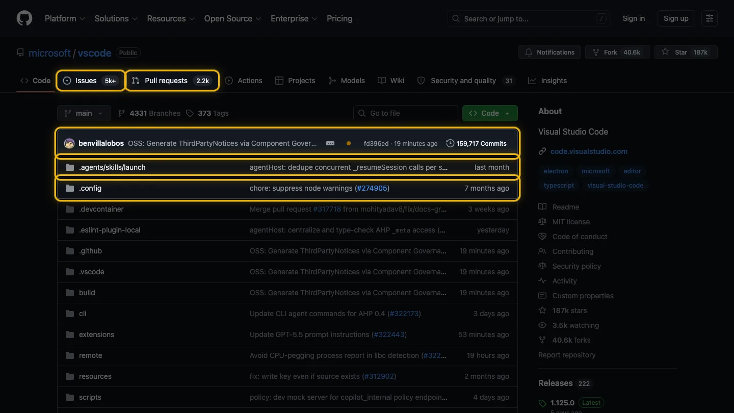
The fix is to keep both: capture enough of the page that the location is obvious, but make the problem element unmistakable. Dimming everything except the relevant element is the cleanest way to do this — the eye goes straight to the issue, and the surrounding layout still tells the developer where they’re looking.
2. Highlight the actual problem, not the whole screen
Don’t make the developer hunt. If the issue is a misaligned button, the button should be the obvious subject of the image. A red box, an arrow, or a dim-the-rest highlight all work — what matters is that there’s zero ambiguity about what you’re pointing at.
This single habit eliminates most “which one?” replies. If you find yourself about to write a caption like “see the thing in the top right,” that’s a sign the screenshot should have shown it directly.

3. Capture the state, not just the page
A bug is usually a state, not a static layout: an error message, a spinner that never stops, a form that rejects valid input, a number that’s wrong. Capture the moment the problem is visible. A screenshot of the page after the error toast disappeared tells the developer nothing.
If the bug involves an error in the browser console, include a second screenshot of the console with the relevant error visible. Developers trust what they can see, and a stack trace often points straight at the cause.
4. Include the evidence around the image
The screenshot carries the visual, but a good bug report screenshot is usually paired with a few specifics the image can’t show on its own:
- The URL where it happened
- The steps that triggered it
- Browser and OS if it might be environment-specific
- What you expected versus what you saw
You don’t need a formal template for this. The classic essay How to Report Bugs Effectively makes the point well: show what happened and how to reproduce it, and let the person fixing it draw conclusions. The screenshot is the centrepiece, not the whole report.
5. Make it consistent and fast
The best bug report habits only stick if they’re low-effort. If adding focus to a screenshot takes three minutes in an image editor, you’ll skip it under deadline pressure. If it takes five seconds, you’ll do it every time.
That’s the practical case for an in-browser highlighting tool over manual editing: the friction is low enough that “highlight the problem” becomes automatic rather than aspirational. We compared the main approaches — manual cropping, DevTools, Figma, and extensions — in our guide to highlighting webpage elements, if you want the full breakdown.
A quick before-and-after
Here’s the same bug, reported two ways:
| Vague report | Clear report | |
|---|---|---|
| Image | Full-page screenshot | Page with the broken element highlighted, rest dimmed |
| Caption | ”Button broken" | "Submit button on /checkout does nothing on click” |
| Extras | None | URL, steps, expected vs actual, console error |
| First dev reply | ”Which button? What page?” | Starts debugging |
Same bug, same reporter, wildly different time-to-fix. The difference is entirely in how clearly the report communicates — and the screenshot is doing most of that work.
The takeaway
A bug report screenshot has one job: let someone who wasn’t there understand the problem instantly. Show enough of the page for context, make the problem element unmistakable, capture the actual broken state, and pair it with the few details an image can’t convey. Do that and you’ll trade a day of back-and-forth for a fix that starts the moment the ticket is read.
If you want highlighting to be the five-second habit rather than the three-minute chore, Spotlight is free to try — highlight the problem element, dim the rest, and your bug report screenshot is done before you’ve finished typing the title.

I build software that fixes the small, annoying problems we all put up with. Here I write about Spotlight, the craft behind it, and better ways to communicate visually.
ajoygonsalves.com →Related posts
Spotlight vs. Figma for UI Screenshots: What's Faster?
The Figma screenshot workflow vs a one-click browser extension. An honest look at which is faster for highlighting UI elements — and when each wins.
How to Highlight Webpage Elements for Clean Screenshots
Learn 4 practical ways to highlight specific elements on a webpage for focused screenshots — from manual cropping to one-click browser extensions.